Make sure that you have downloaded the correct version. Windows build file ends with "win", Mac OSX build ends with "osx" and multi-platform build does not have any suffix and will work pretty much anywhere where Java JRE runs.
<path to diylc3>) and type ./run.shUser interface can be separated into 4 major sections:
Application configuration may be changed from Config menu. It contains the following items:
This sections explains how to add an existing component to the project. To learn how to develop your own components follow this tutorial. To instantiate a component, follow these steps:
Tip: pressing the tilde ('~') key repeats the last added component and places it at the current mouse location.
Method 1: drag the selected component(s) across the canvas by clicking on the selection and moving the mouse to the desired location. When mouse cursor is over a component, it will change to "hand pointer" and status bar will read name of the component that will be dragged.
Method 2: move the selected components is using arrow keys with "Ctrl" key pressed.
For methods 1 and 2 note that:
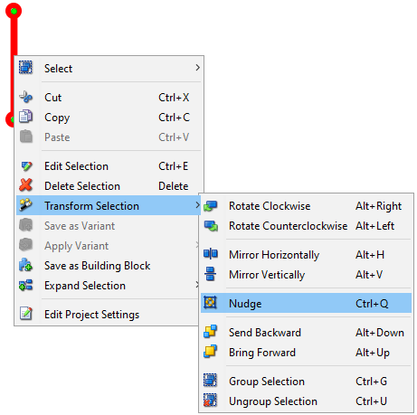
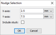
Method 3: using the "Nudge" function from the "Transform" menu (or using the "Ctrl + Q" shortcut). It opens a dialog where you can type in the exact offset on both X and Y axis and specify whether to include stuck components or not.
A component may have one or more control points. Control points determine component's position on the layout and in some cases allows the component to get connected with other components. For some components, such as resistors, wires, etc, individual control points can be moved around when the component is selected.
Note that:
Newly added components are assigned with default parameters (size, color, value, name, etc), but it is possible to edit them in a few different ways. The simples way to edit properties of a single component is to double click on the component. Another way to do it is to select "Edit Selection" from the context menu aciton or press "Ctrl + E" on the keyboard. The second approach also allows editing multiple components at the same. When editing multiple components at the same time, only properties common for all the selected properties will be shown. If we, for example, want to edit a resistor and a capacitor at the same time, we will not be able to edit capacitance or resistance because they apply on to one of the selected components. Input boxes that represent properties that have mixed values are highlighted in yellow to designate that we cannot see all values from the selection. Changing a value in the yellowed box will appply it to all the selected components.
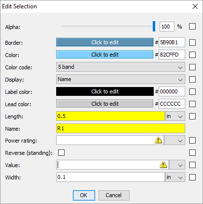
Checking the "Default" checkbox on the right side will make the value for that property a default for the component. In other words, all the components created after that will inherit that value instead of the factory default value.

Input boxes that represent measures (size, resistance, capacitance, etc) can take math expressions in addition to constants. For instance you can type 3/32 and it will be automatically converted to decimal. Even more complicated expressions with parenthesis and 4 basic numerical operators are possible.
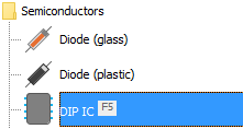
To speed up the workflow, it is possible to assign keyboard shortcuts to up to 12 most commonly used components and create them quickly without having to move the mouse away from the canvas. Only "F" keys can be assigned as keyboard shortcuts at the moment. To assign one of the "F" keys to a component, use "Assign Shortcut" menu from the drop down menu in the component toolbox.
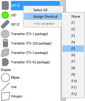
Components that have keyboard shortcuts assigned show a visual indicator on the right side of the component name to designate the corresponding key.
To remove a keyboard shortcut, just select "None" from the "Assign Shortcut" menu.
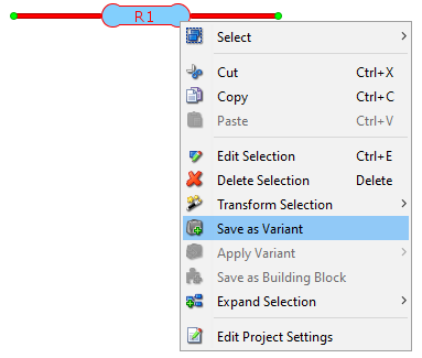
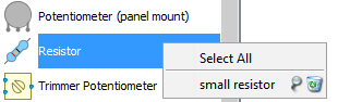
Each component is created using default values for size, color, etc. Users can make their own variants of components with different properties. After the component is edited to the desired state, it can be saved as a variant using the context menu action.
After saving, the existing component variants can be employed in few different ways. One way would be to apply the variant to the existing component by using the context menu.
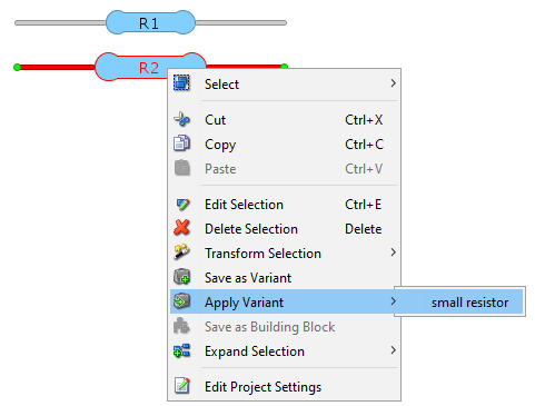
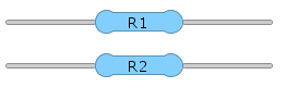
Applying a variant will copy all the properties associated with the variant to the selected component and transform it to conform the variant.
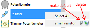
Another way to use variants is to add a component to the project using a saved variant as a blueprint. This can be done by right clicking on a component icon in the component tree and selecting a desired variant from the context menu.
Furthermore, a variant can be set as default and all components created after that will inherit their properties from the default variant. That can be done by using the pin button in the aforementioned context menu. Next to the pin button is the delete button we can use to delete a variant.
Component grouping works similarly to the way object grouping works in most vector-based drawing tool. The idea is to keep two or more components together and move/edit/delete them at the same time. To group components, select them and press Ctrl+G (or select "Group Selection" from the menu). Double click on one of the grouped components will open the editor with all the mutual properties of selected components and allow editing them at the same time. Note that while the components are grouped, you cannot edit drag their individual control points. To un-group the components, select them and press Ctrl+U (or select "Ungroup Selection" from the menu).
Note that:
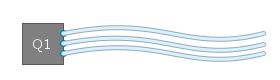
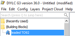
Often times we use a cluster of components arranged and configured in a certain way repetitively. To speed up the process, DIYLC allows for a group of components to be saved as a building block and recalled simply by one click. This saves time needed to add each individual component and configure it to look the way we want. Suppose we want to make a leaded TO92 component. DIYLC provides enough pieces to build one. We can add a folded TO92 body together with three separate wires.
To save this as a building block that we can use later, we need to select all four components and select "Save as Building Block" action from the context menu
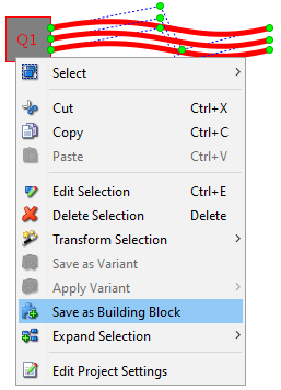
The newly created building block appears immediately under "(Building Blocks)" folder in the component tree and can be used just like any other component.
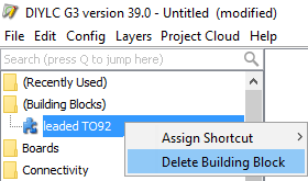
To delete an existing building block, use the context menu action.
Component position is specified not only in X and Y axis, but also in Z axis, allowing us to control which components will be displayed on top of other components. Unlike Corel or Photoshop, Z-order of components in DIYLC is not completely free-form. Based on their nature, components are categorized into 5 "layers": Chassis, Board, Trace, Component, Text. All components in the "Board" layer will be assigned with lower Z-order than components in the "Trace" level, all components in the "Component" level will be put on top of components from "Trace" level, etc. 'Send to Back' and 'Bring to Front' operations typically operate within the given layer, but it is possible to force the component to move across other layers. DIYLC will prompt you to confirm this operation when selected component reaches the bounds of its layer.
DIYLC offers few functionalities for working with layers:

Status bar contains the following sections (going left to right):